Citi Bike
Riders can't count on finding a bike or a dock when they need one. I designed the feature that finds it for them, plus a rewards system that keeps stations stocked.
1,000+
Stations, still hard to find a bike
5
Rider interviews
8
Usability test participants
4
Iterations from testing
The Problem
NYC has over 1,000 Citi Bike stations, yet riders still can't reliably get a bike, or return one. Interviews and app-store reviews kept pointing at three failures:
Station roulette
Riders can't tell which nearby station actually has bikes without digging through the map, tap by tap.
Status changes mid-ride
A dock that was open at departure is full on arrival, and the app offers no alternative until you're already there.
Chronically empty corners
In some neighborhoods stations are always full or always empty. That's a distribution problem, not a map problem.
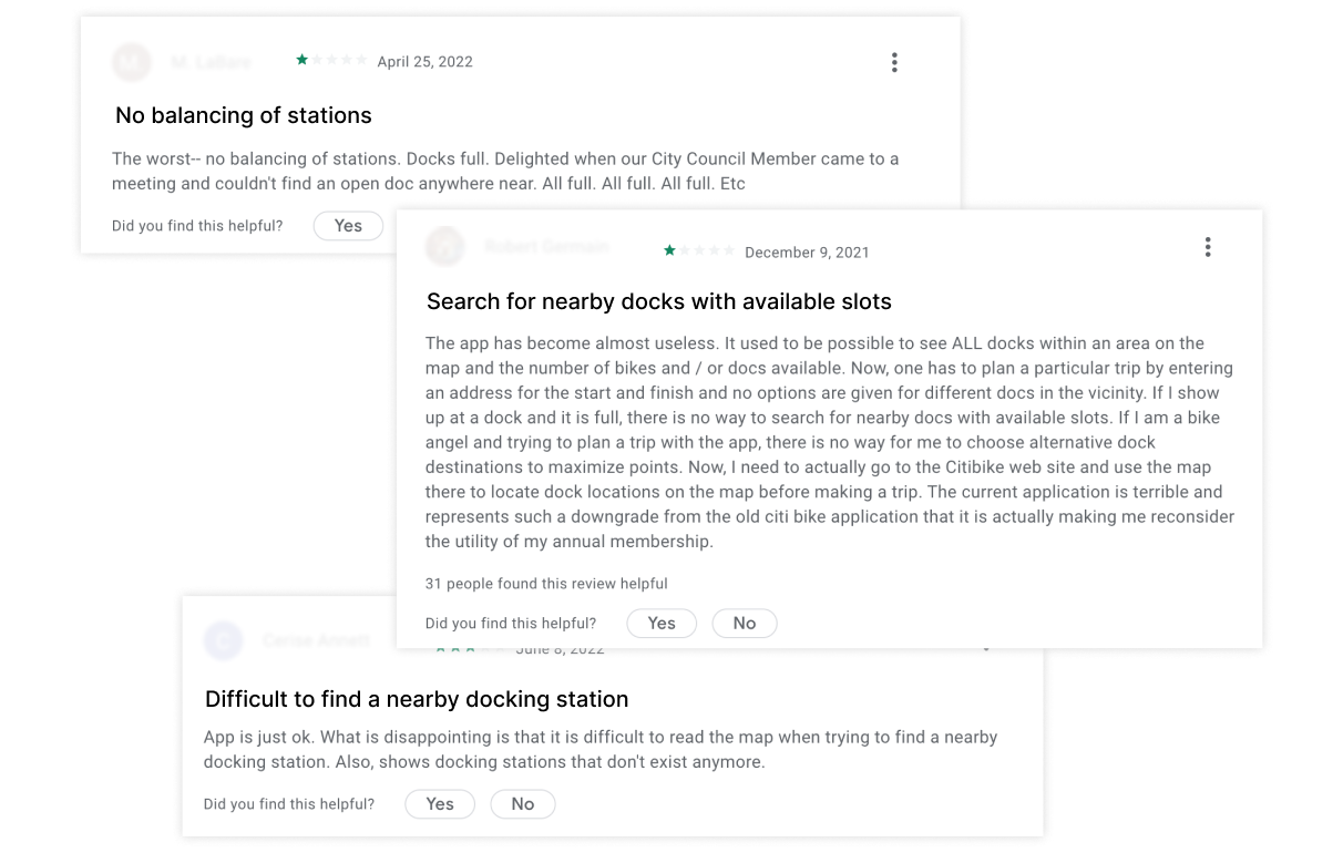
“How might we automatically find riders an available station and keep track of it while they ride?”
Research
5
Rider interviews
8
Usability tests
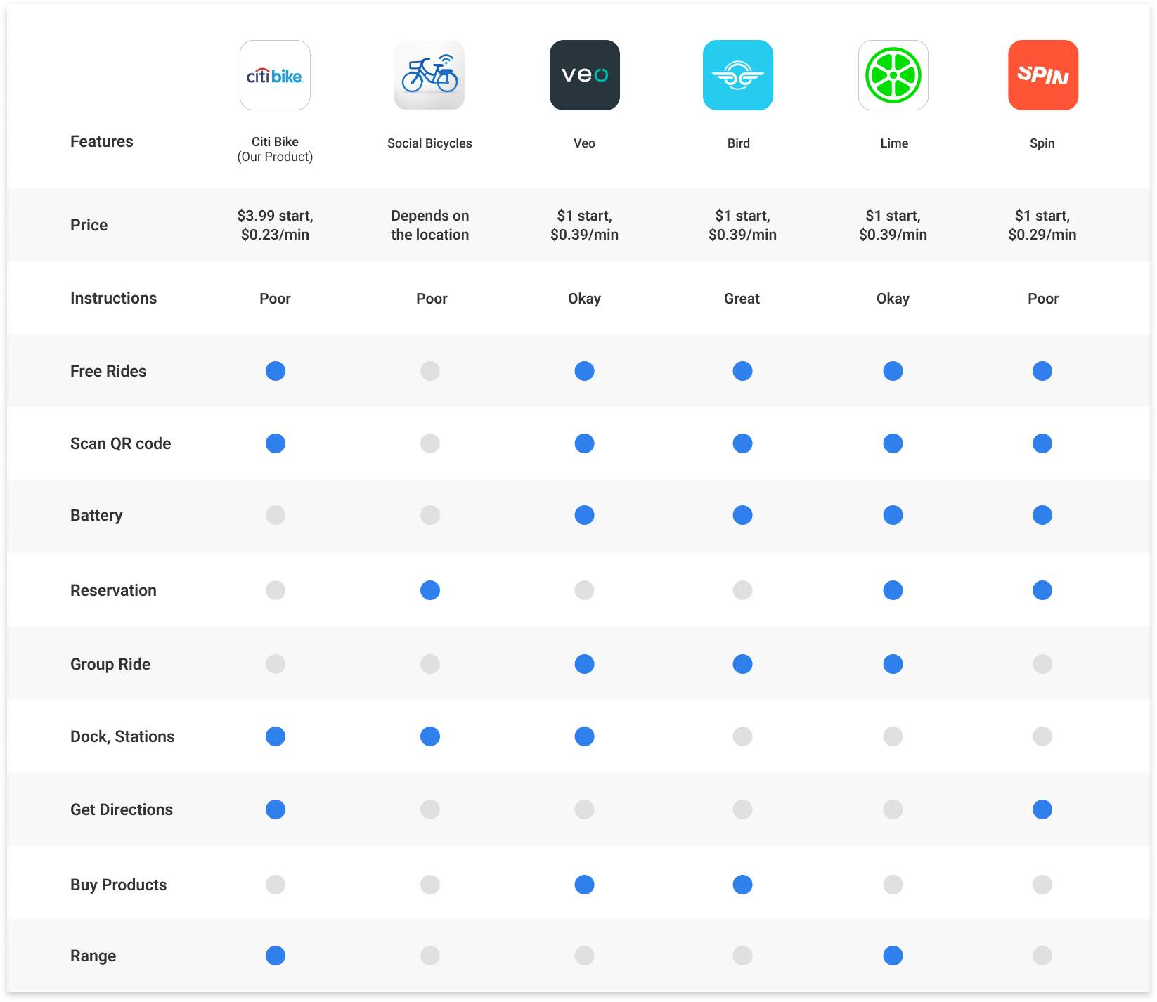
Competitive analysis: feature comparison
Dock-based vs. dockless: strengths and weaknesses
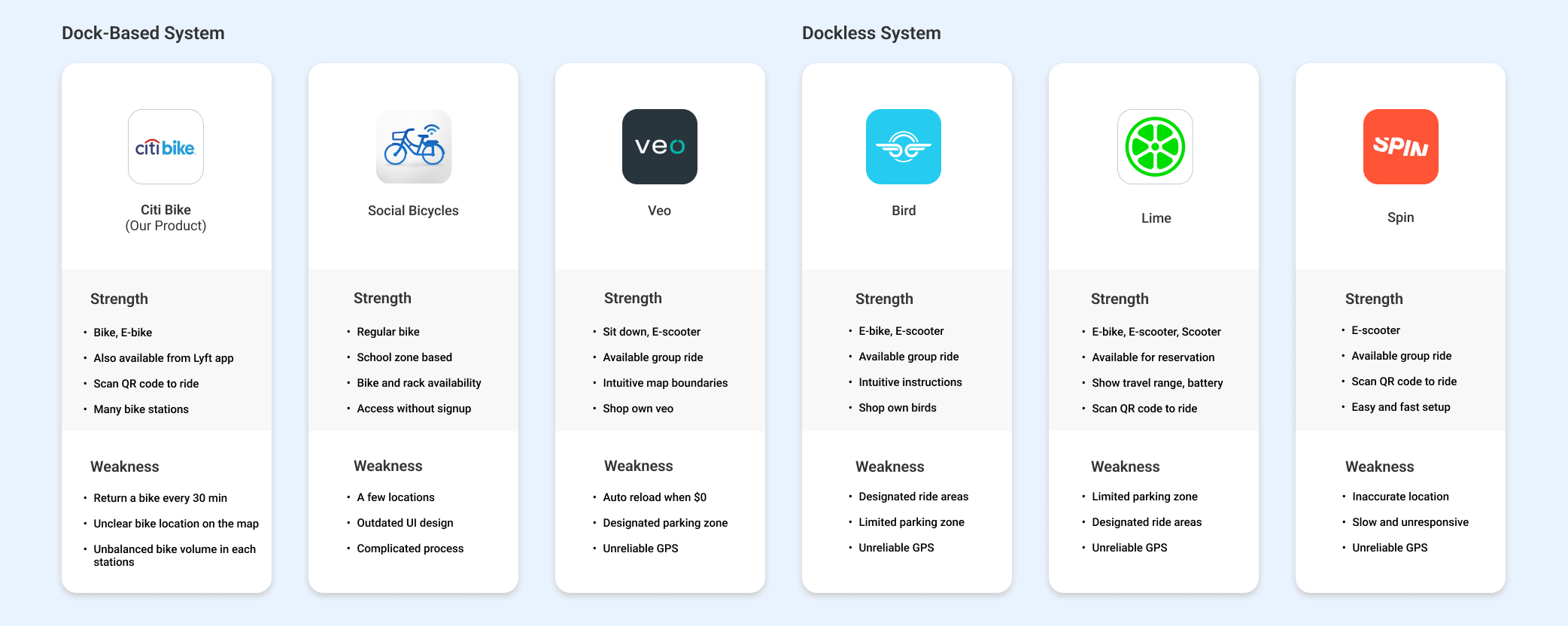
The decisive finding: availability isn't a snapshot, it's a moving target. Station status flips while you're riding, so a better map wasn't enough; the app had to watch the station for you.
The Solution
Pain: Can't tell which station has bikes
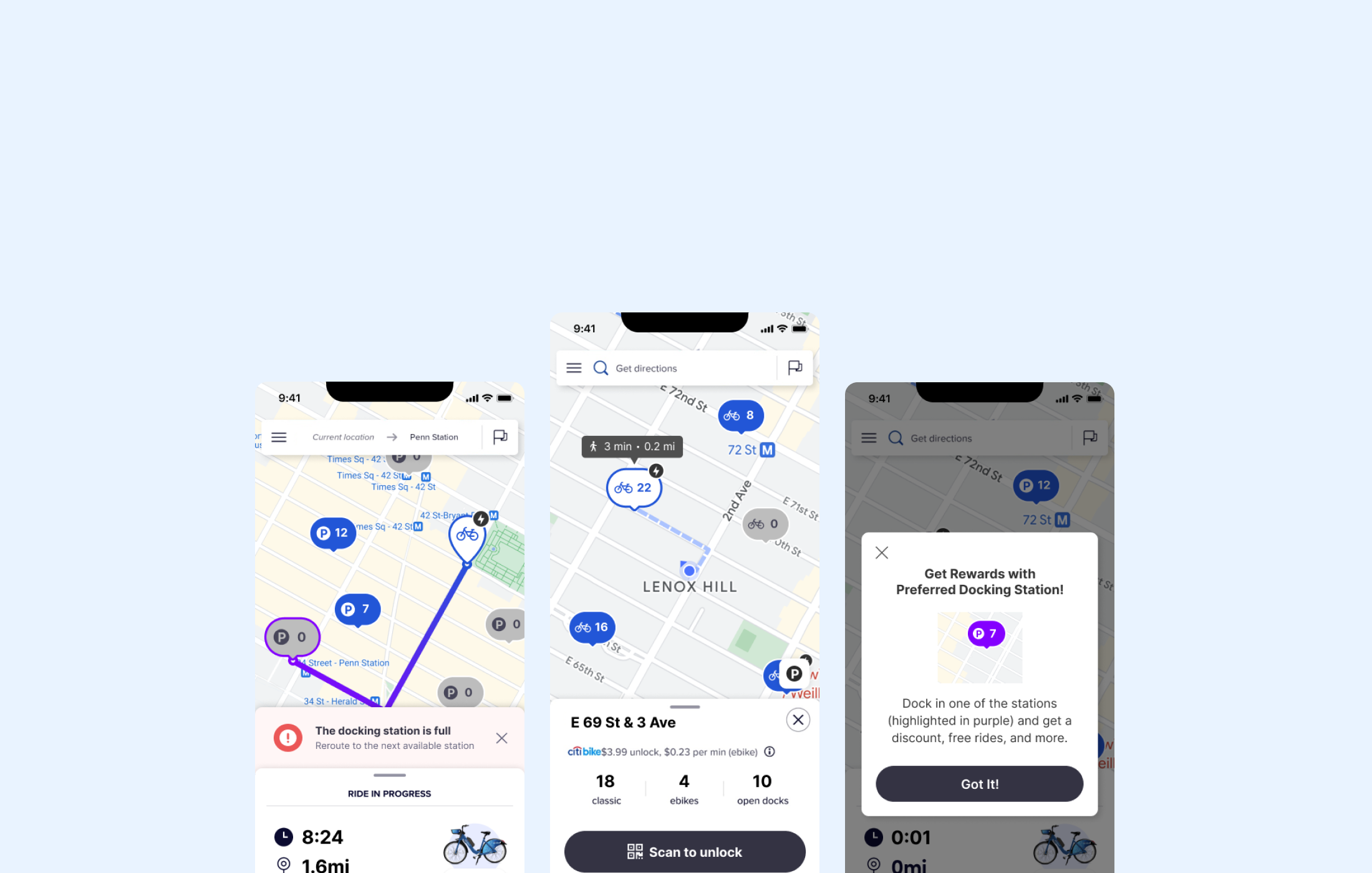
The nearest available station, one tap away
The app finds available stations the moment it opens, with travel time and distance up front, so riders know when they'll arrive, not just where to go.
Usability testing reshaped the map itself: bike and parking icons replaced bare numbers, and colorblind-safe outlines replaced color-only status.
Pain: Status changes while you ride
Alerts and automatic rerouting, mid-ride
If your dock fills up en route, the app notifies you and reroutes to the next available station, with no stopping to search.
Testing killed my original design: riders didn't want to choose from a list mid-ride. I cut the station-selection screen entirely and made rerouting automatic.
Pain: Some stations are always full or empty
Rewards that rebalance the system
The empty-station problem can't be fixed by UI alone; it's supply-side. I extended the Bike Angel program to all riders: return a bike at a highlighted low-availability station, earn rewards.
Every rider becomes part of the rebalancing operation, which makes the station finder more reliable for everyone.
Design Foundation
Task flows and storyboards for both features, wireframes pressure-tested before high fidelity, and a style tile reverse-engineered from Citi Bike's brand, because the concept had to feel native to the existing app.
Outcome
8/8
Testers responded positively to the new flows
2 of 4
Iterations came from accessibility findings
Cut the screen I designed
Testing showed riders wanted rerouting the moment an alert arrived, not a selection page. I deleted the step and made it automatic. The best iteration was a subtraction.
Fix the system, not just the screen
The map couldn't solve chronically empty stations; bike distribution could. Pairing the finder with rebalancing rewards treated the service as one system, which is the approach I bring to every product.
More Work
© 2026 Lina Kim